In this case study, I want to explain the whole process of re-designing the insurance home page in AP. This project took almost 2 months and this document is a summary of those 2 months.

Product strategy changes
After the business model changed, the sale of secondary insurances was no longer important to us and we wanted to increase the sale of our main insurances in order to reach new targets. In 2023, the sale of main insurances grew by more than 900%, but this was not enough and we needed to sell more.
Solve user problems
In addition to the strategy changes, there were many requirements for users that were formed over time due to the development of some features, and we did not find enough time and resources to meet these requirements. Finally, to get more market share in this field, we needed design solutions for a better user experience.
Redesign of the main touch points
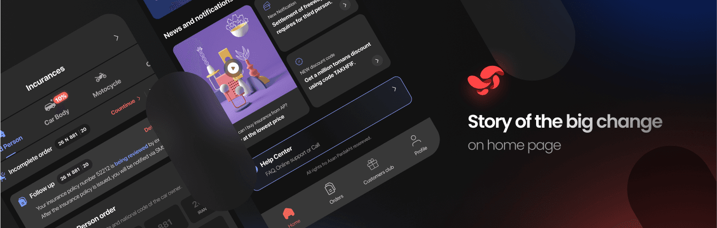
In order to take a step towards new goals and create a better design experience, we revised the main pages in the user purchase flow (i.e. homepage, PLP and payment method). The first step was redesigning the home page; the most important page in the product, which we had to change with special obsession.
Getting on the same page about home page problems
At first we started collecting different data. We used our user tracking tools (such as Clarity, WebEngage, etc.) and data from the call center team.

Prioritization
Every data was interesting for us and we documented everything. This approach led to the creation of many documents, which practically could not solve all the problems and required a lot of time. During the numerous and consecutive meetings of the product, business, and tech teams, we were able to conclude about many changes.
Here are some examples of those important needs:
Users could not easily track the status of the product they bought! Many of these follow-ups were done offline by contacting the support and sales team
Users did not understand the deferred installments and how to pay them. With the development of the direct payment method, there was a need for a place in Home where users could pay their overdue installments.
Users do not use the feature of incomplete orders in the application even though they need it. Due to the long purchase flow, not using this feature made users reluctant to start again.

Ideation and creation
The first stage of userflow design was to apply the desired changes to the current userflow of users' purchase flow. In the next step, I started to design the wireframe. my most important challenge was to change the user input form. In the old version, all products were placed on the home page for users, But we needed to direct users to our main purchase flows faster and more easily. At this stage, I designed many drafts in the wireframe layer, some of which I will post here.
UI drafts
After many meetings, we finally decided on the user navigation model on the home page. Considering all the advantages and disadvantages of different versions, we chose one version as the winning design and based on that, we started UI Design. We had gone through the biggest redesign challenges and I had to design the UI with AP design system and maintain the identity of insurance product.
Prototyping, testing and implementation
After conducting some tests with the help of AI and usability testing with colleagues, I realized the improvements and shortcomings of the new design. After solving problems, which where mainly insignificant, I demoed the final designs to the team and with the team's approval, the homepage redesign task was placed in the technical team's sprint.
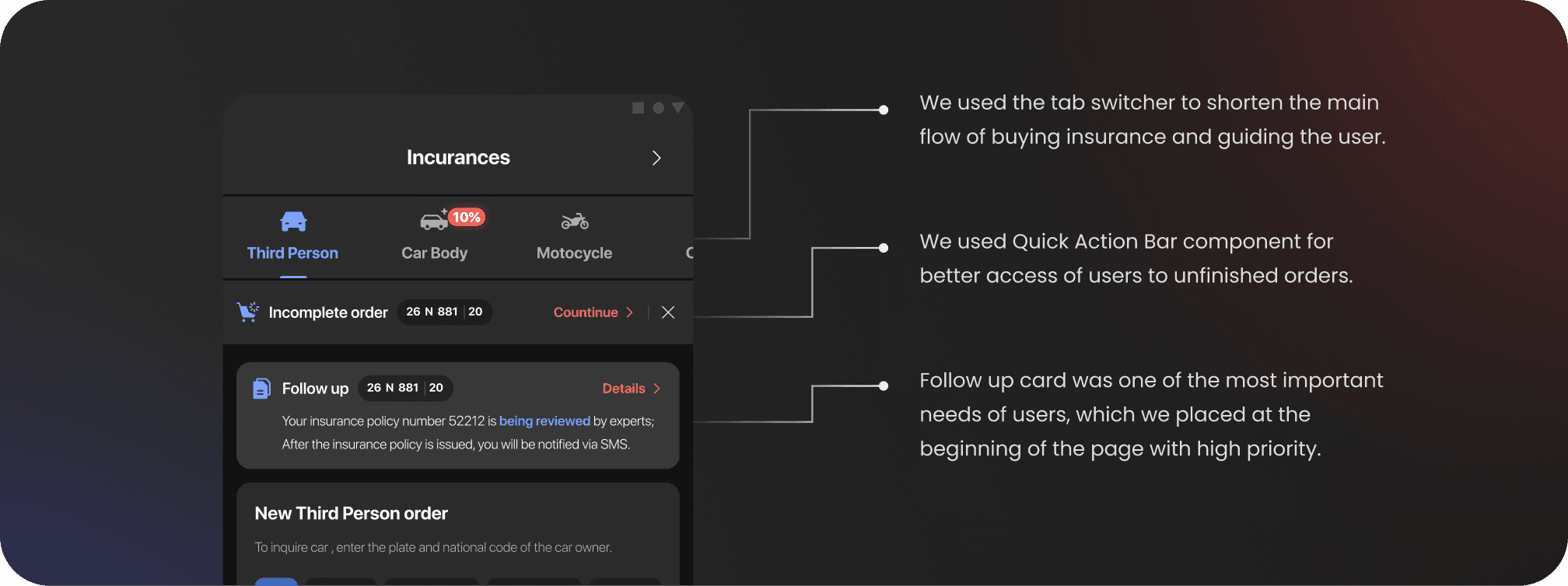
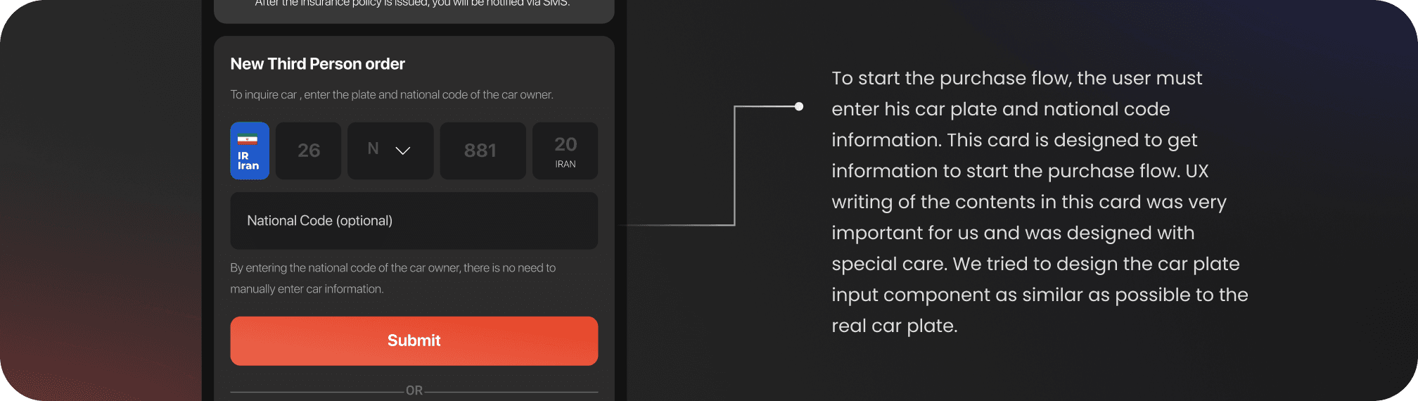
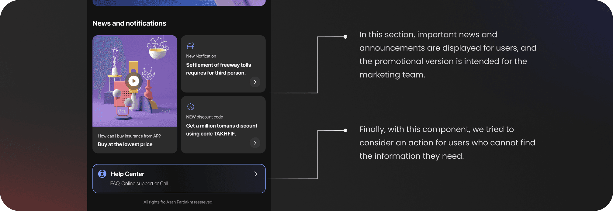
Components details and functionality
The components described are all components on this page. It is almost impossible for the user to see all these together, and I put them together to explain all the changes.